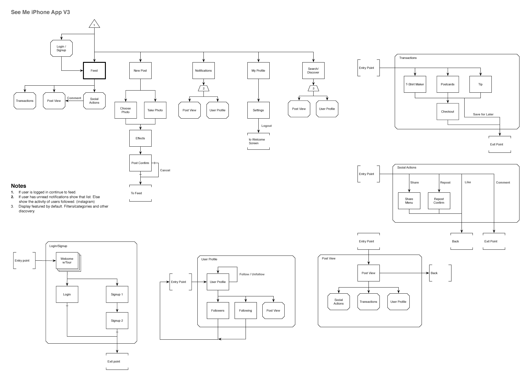
Our original iPhone app was produced in the very early days of the site and fairly static. We started from scratch with the new version which was all about social and commerce. This version still revolved around the feed but I tried to use a similar conceptual model as Instagram, Vine, Facebook, and Tumblr.
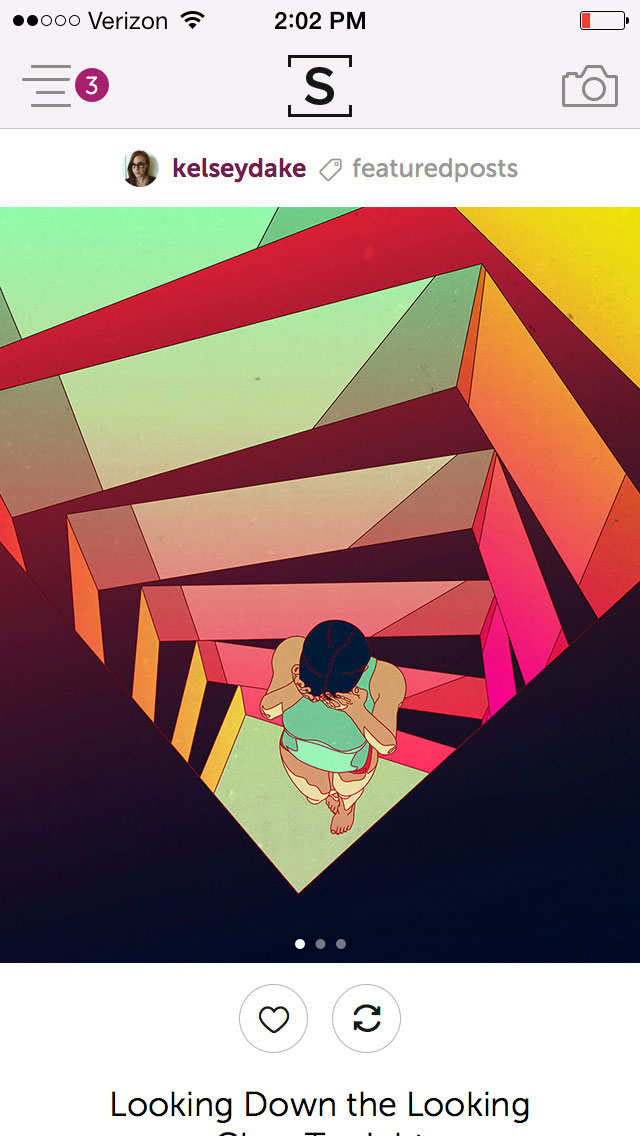
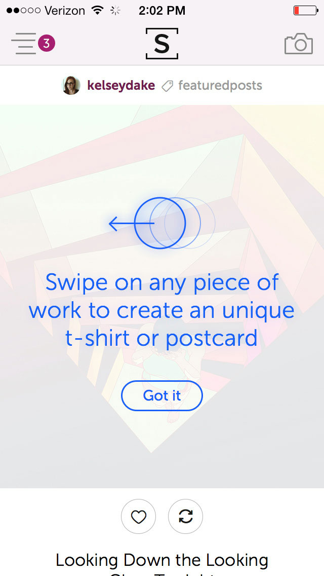
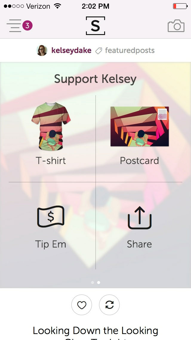
The user will spend the majority of their time on the Feed but we added a swipe interaction to each image that reveals our transaction options which are buying a t-shirt or postcard of the print or tipping the user. Following and Discovery were also large parts of this release along with a new post mechanism that pushed simplicity and tagging.
Incorporating our transaction system into the app in a way that was not too pushy. We wanted the app to push social engagement. Users should follow friends, like, and comment on work. They should also, hopefully, buy postcards, t-shirts and tip other users.
We hid these transactions with a swipe-on-image. Users simply thumb to the the left over any image and can choose a transaction item to customize it. The action is fun and memorable and keeps the main view of the app from looking like an e-commerce platform.
This is the original flow of the app. We had a bit of feature creep so the layout shifted slightly during production to accommodate our deadline and keep to an MVP release.
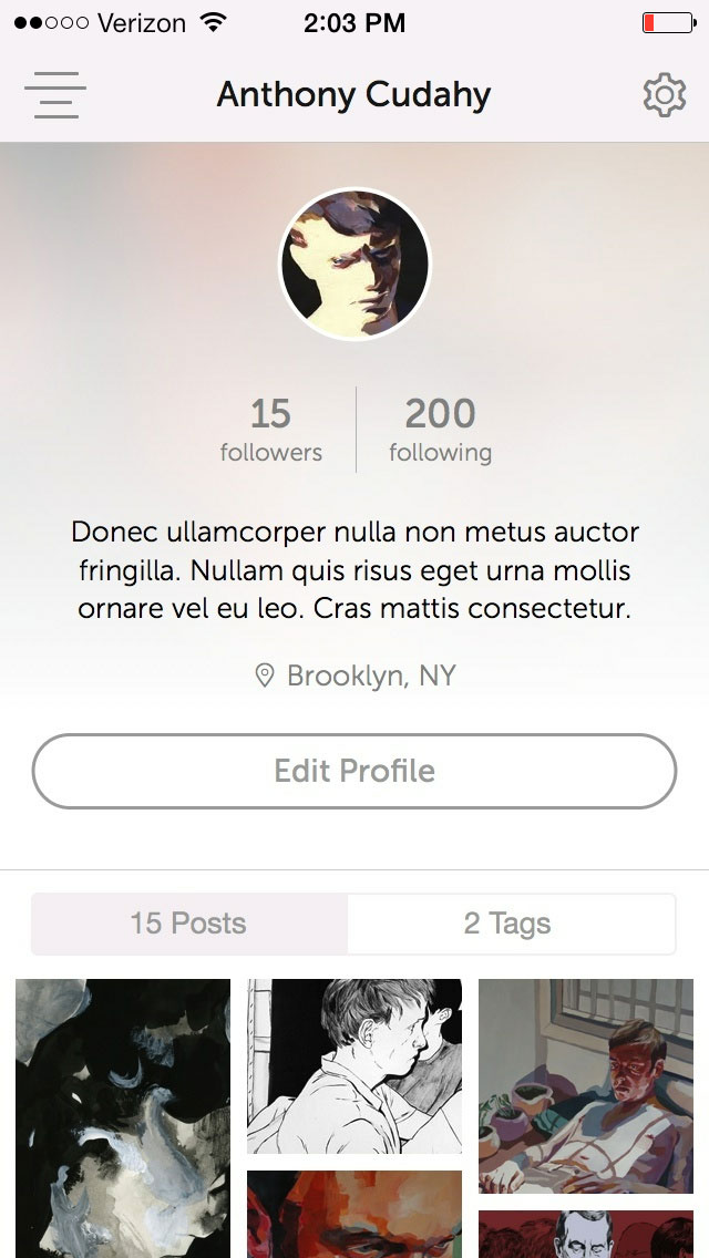
Our relaunch brought a big transition to a more social platform that focused on presenting content over user profiles. Keeping an artful presentation of the work was a priority that needed to be balanced with the new abundance of features.
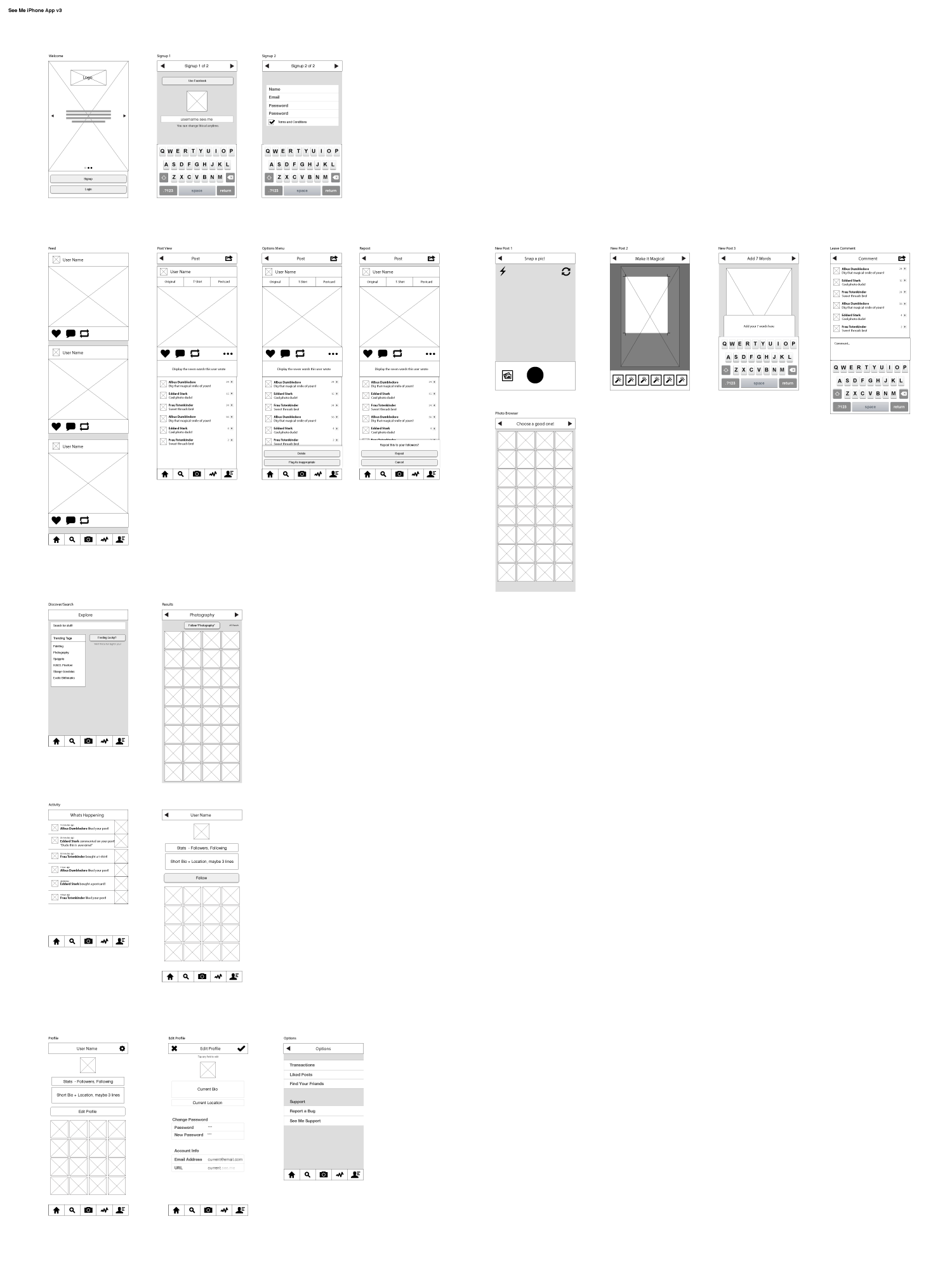
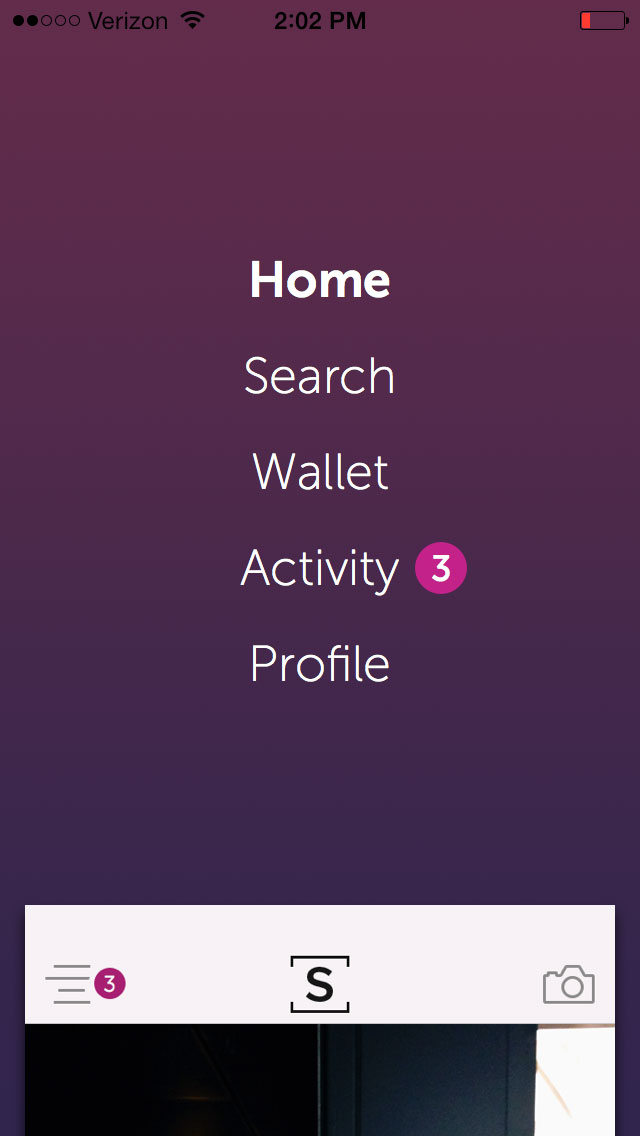
For the final designs we ended up removing the bottom persistent menu with center add-content button and chose a hidden menu accessed in the upper left with a persistent add-content button in the upper right.